Category :

Chocolate Brand

Client :

Loriva

Date :

March 21, 2025

01. The Challenge

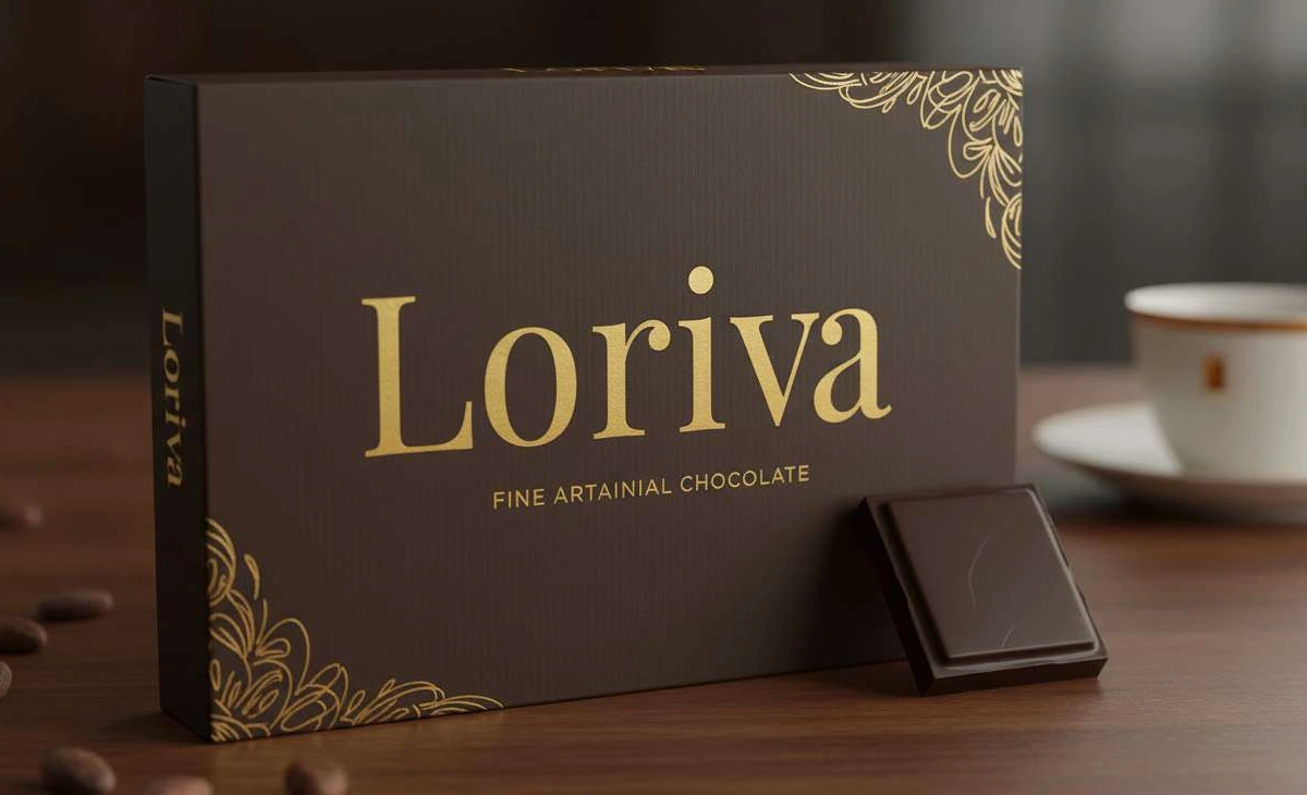
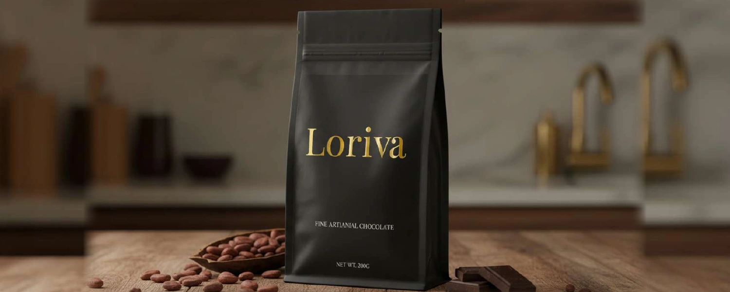
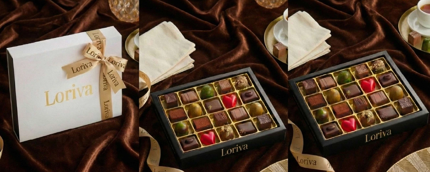
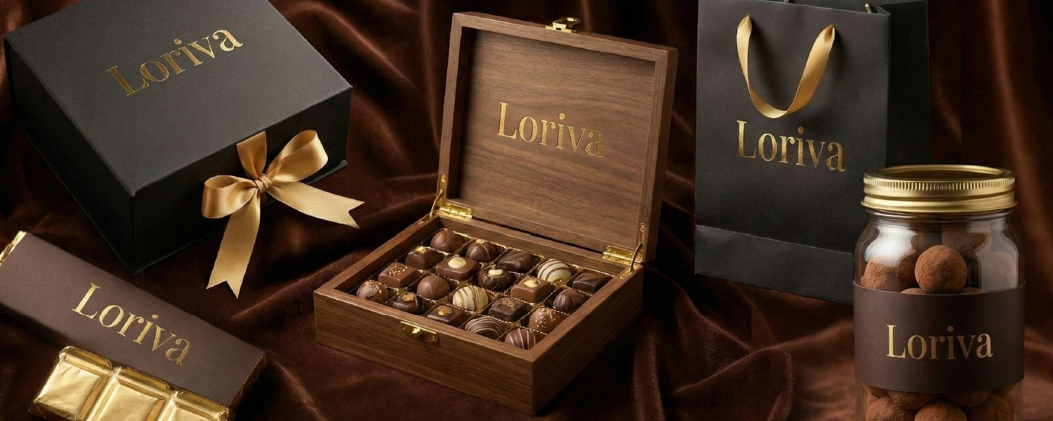
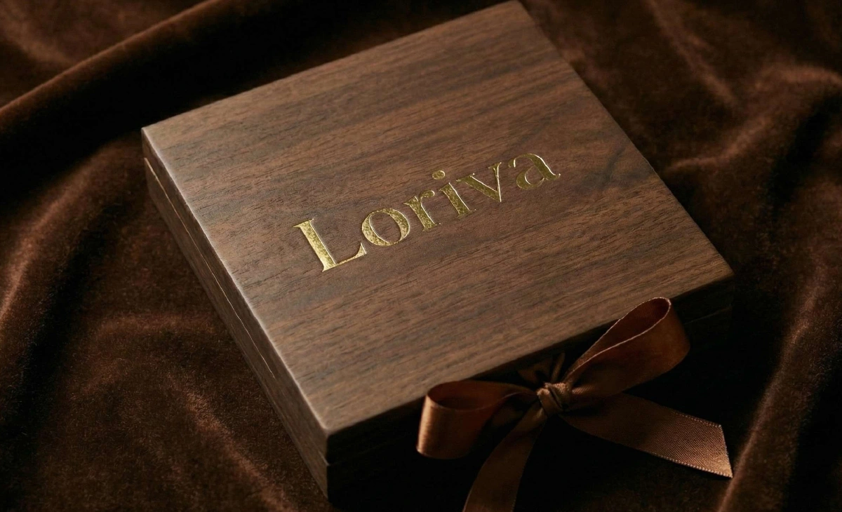
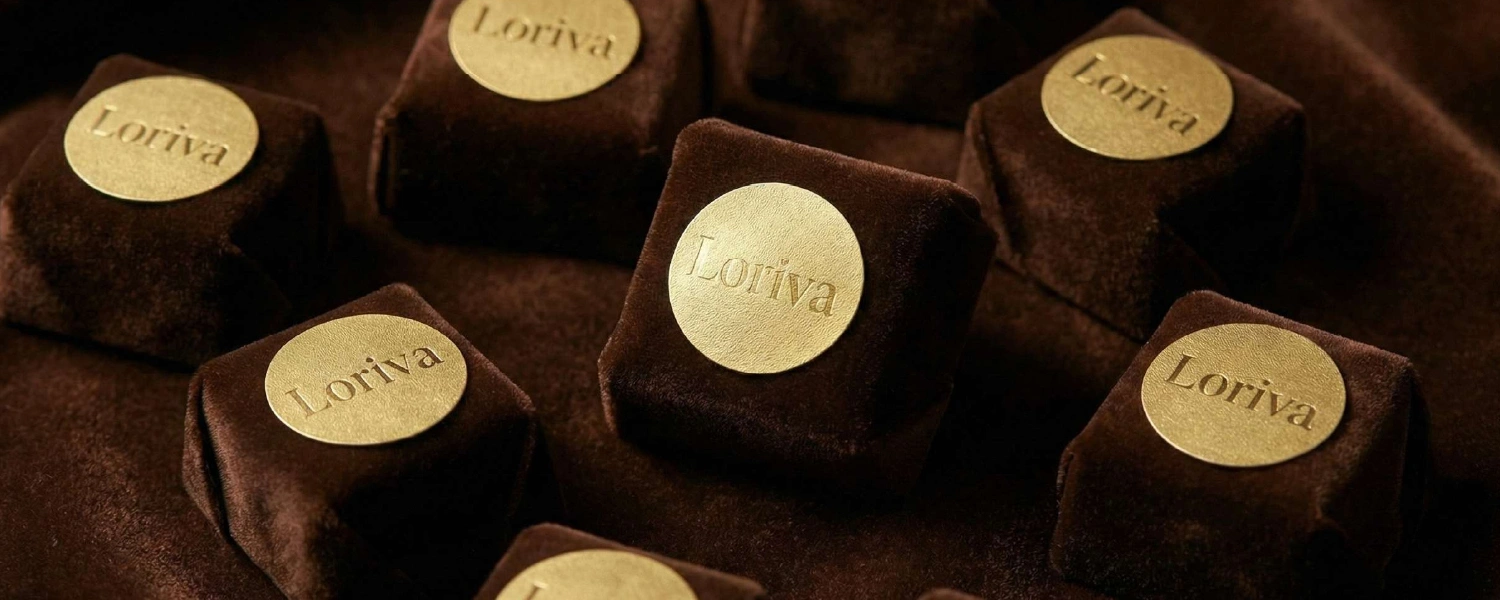
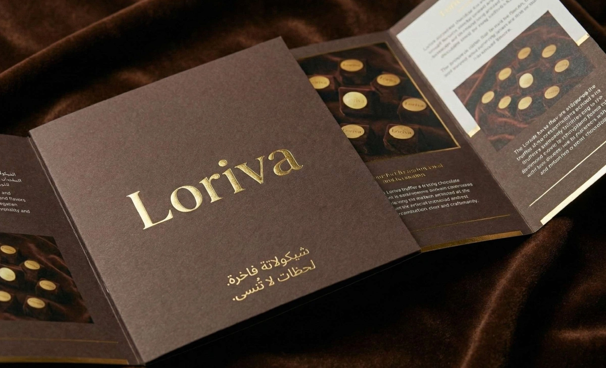
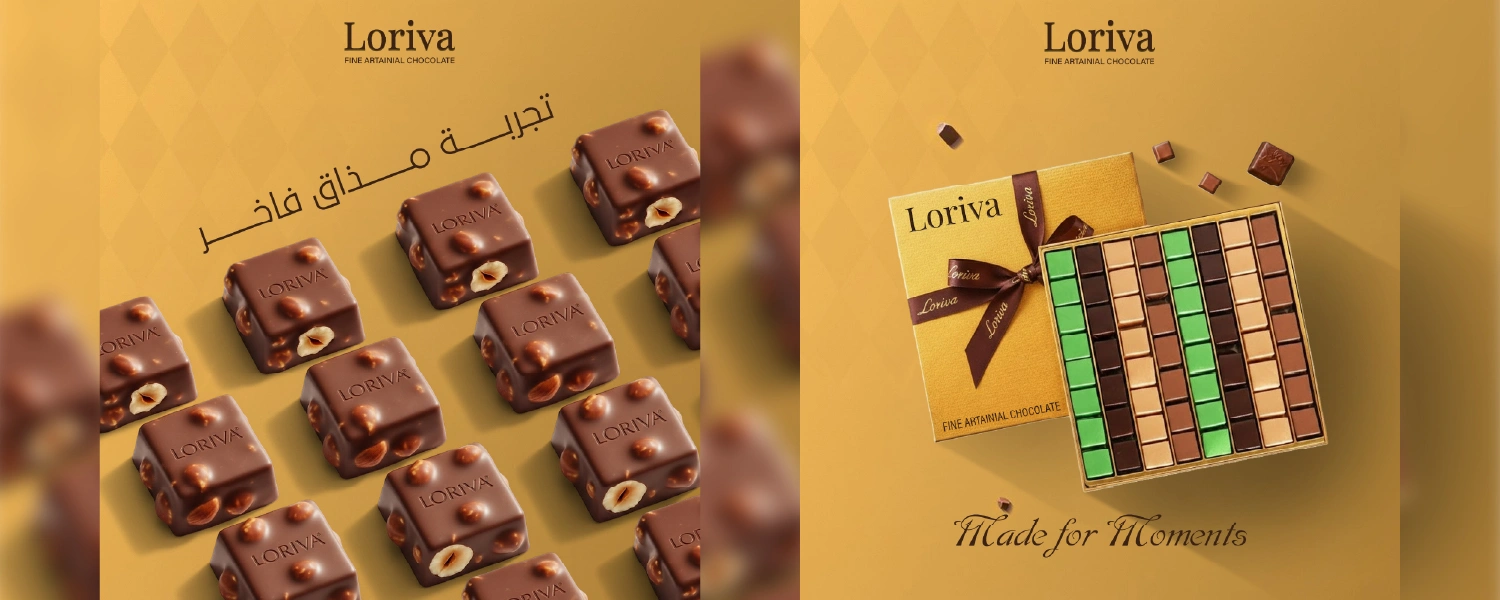
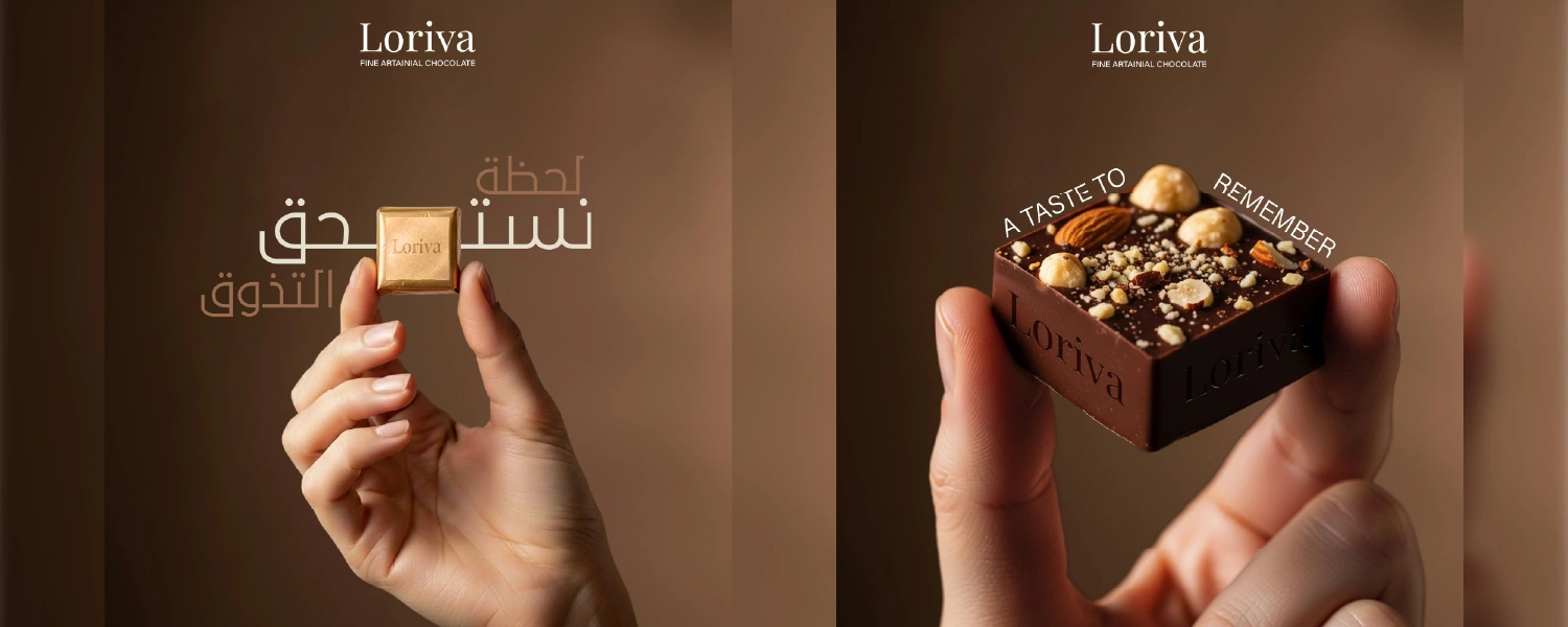
Loriva sought to enter the market not just as a chocolate brand, but as a purveyor of “quiet luxury” and “timeless sophistication”. Targeting discerning customers in Türkiye, Somalia, and Arab countries, the brand needed to distinguish itself in a noisy world by choosing to “speak softly”. The challenge was to create a visual identity that communicated that Loriva chocolate is not merely a product, but a refined moment to be savored slowly.

02. The Solution

We developed a brand personality rooted in “luxurious simplicity”. The visual identity centers on the elegant “Playfair Display” serif typography, selected for its classic and high-end appeal. The color palette is a rich combination of deep chocolate brown (#3b2314) and black, accented with metallic gold to evoke warmth, purity, and premium quality. This design approach ensures the brand feels handcrafted and artisanal, matching the “carefully selected cocoa” used in the product.

03. The Result

The resulting identity successfully elevates Loriva to a status of “classic elegance”. The extensive use of gold foil on dark textures creates a stunning contrast on packaging, from gift boxes with ribbons to glass jars and chocolate bar wrappers. The cohesive branding establishes Loriva as a luxury experience, ensuring that every piece is perceived as a gift to be remembered.

Shopping Basket